Example Using â vs. a Data
Collecting Data
In a POD study, inspection results are collected for many different combinations of flaw sizes, probe serial numbers, inspectors, and many more factors that act as sources of variability. An example of this type of data can be seen in Fig. 4. This data is simulated, but in general, a series of flaws with varying sizes in different components are inspected with a number of inspectors to give varying signal strengths. Plotting signal strength as a function of flaw size reveals the behavior of the NDE sensor as a function of flaw size. This specific plot shows that the signal generally increases as a function of flaw size, and the increase is loosely linear.
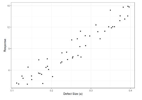
Figure 4. Figure showing signal strength plotted as a function of the flaw size
Model Fitting
A key step in analyzing the data for POD is fitting a model to the data. The model is a statistical representation of the behavior of the data that also numerically represents the random behavior that can be seen in data. For instance, in the case of the data found in Fig. 6, we can assume that the model that best describes the data is a line and is written as:
â = β0 + β1a + ε
where â is the signal strength, β0 is the y intercept of the line, β1 is the slope of the line, a is the flaw size, and ε is a random variable describing the distribution of the data about the line described by β0 and β1.
In the example shown here, a known model was used to generate the data for the plot in Fig. 5. However, in practice the model is not known and must be estimated from the data. Specifically, we need to estimate the model parameters β0 and β1, as well as the parameters that describe the distribution of ε. In general, the distribution of is assumed to be Gaussian with a zero mean and non-zero standard deviation, σ. Thus, σ is the only other parameter that needs to be estimated from the data (these assumptions are critical and verifying them after data analysis is very important).
In estimation, the goal is to select a form for a model (e.g. a line with slope and intercept) and find the parameters that minimize the distance from that model to the data in some sense. One way to think about this is in terms of minimizing the distance between the data and the model for each data point. This is typically called least squares, and can be written as:

In this equation, yi is the result from an actual inspection of a flaw with size ai. Finding the parameters, β0 and β1 that minimize this quantity will give a best estimate at a model that predicts the signal given the size of the flaw and the data. The parameters now have tilde accents to make clear that these are no longer exactly known quantities, but that they are quantities estimated from data. In fact, because they are calculated using random variables (i.e. the data), they themselves are also random variables with distributions determined by the distribution of the error term in equation (1).
Another way to think of model fitting is in terms of linear algebra. If we write out the model in equation (1) in terms of the actual data points from the experiment, we get the following expression:

This is now a matrix inversion problem with a rank-deficient (non-invertible) matrix, X. The solution to this problem is actually equivalent to the solution to (2) in this simple example case shown in Fig. 4. An example of the model fit to the data is shown in Fig. 5.
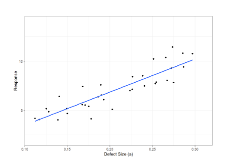
Figure 5. Image of a model fit to the previous data
POD(a) Calculation
At this point, we have calculated the parameters of the model that we think describes the data well. In fact, this calculated model describes the mean of the signal strength as a function of flaw size. However, as shown in Fig. 5, the signal strength at each flaw size is a random variable with a distribution defined by ε. To determine the probability of detecting a flaw of a specific size, a, we need to determine the probability that an inspection will give a signal value above some threshold, âth. In an NDE inspection, this âth is known as a detection threshold, and any signal recorded above this is considered a detection. Now, if Fig. 5 is rotated 90 degrees, we get the plot shown in Fig. 6b.
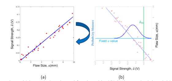
Figure 6. Figures showing (a) the estimated signal strength from the model and (b) the plot rotated with the probability density function at a specific flaw size plotted. The detection threshold is shown in green.
Fig. 6b shows the “Probability Measure” on the left axis. This probability measure is known as the probability density function (PDF) and it is determined from the distribution of the noise term in (1). This is almost always assumed to be a Gaussian random variable (bell curve) in the context of POD, though the data are not always described well by a Gaussian distribution. However, in practice there are a number of transforms that can be used to allow the data to be better represented with Gaussian distributions, and thus the Gaussian is a very important model for representing the uncertainty in the inspection.
Given the PDF, we can then estimate the probability of detecting a flaw of a given size, a, by integrating the area under the PDF curve from the signal threshold to +∞. By definition, this gives the probability that the signal will fall above the detection threshold (i.e. the flaw will be detected). If we perform this calculation for every flaw size in the range of interest, we generate the curve shown in Fig. 7. This is the probability of detection curve, or the mean POD(a).
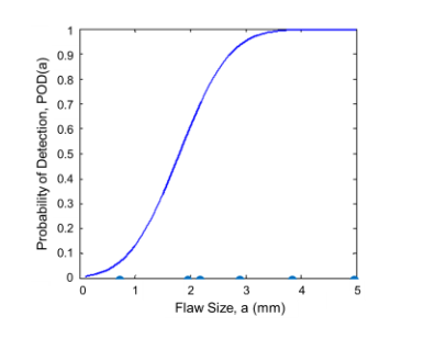
Figure 7. Estimate of the mean POD curve as a function of flaw sizes.
Confidence Inverval
Why is this POD curve the mean POD curve? In the previous simulated example, we estimated the parameters of the linear model from data. Whenever parameters are estimated from data, there is some uncertainty associated with that estimate. Effectively, we never have an infinitely large data set in practice. If we did, then we could know the parameters β0 and β1 perfectly. This is not possible, so we estimate them from limited data. This implies that the model parameters are themselves random variables with distributions, and these distributions are a function of flaw size. In other words, there are any number of models that may describe the data based on the fact that the model parameters could have any value within the distributions that describe them.
Because of this, we have to incorporate this uncertainty into our estimate of the NDE capability. A broadly accepted standard in the NDE community is the 95 percentile POD curve. This is the curve for which, if this study was repeated many times, 95% of the resulting mean POD study curves would fall below. This curve is shown as the green dashed curve in Fig. 8.
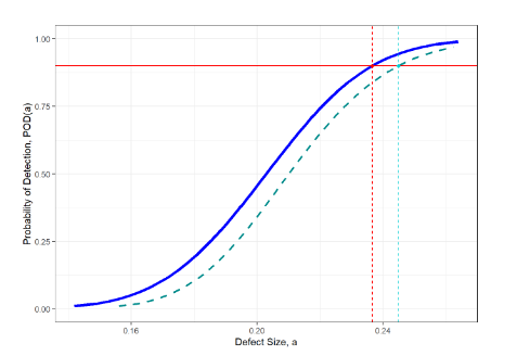
Figure 8. Image of the mean POD function, the 95 percentile POD function (light green dashes), the a value for which the probability of detection is 90 (the red dashed line), and the corresponding value on the 95th percentile POD curve.
From these two curves, we can get the flaw size for which the mean POD curve predicts a probability of detection of 0.9, a90, as well as this flaw size on the 95th percentile curve, a90/95. This is what many in the NDE community refer to as aNDE, and is typically used as the NDE capability for understanding the new crack length on the crack growth curve, as in Fig. 2. It can be interpreted as the flaw length for which the POD study predicted a probability of detection of 90% with a 95% confidence interval. The confidence interval is saying that, given uncertainty in the POD study from limited data sets, the flaw size for which the POD is 90% would fall at or below a90/95 in 95% of the POD curves that could be drawn from the model estimated from the data. It is important to note that this should be conservative as this value is used to ensure the safety of the system being inspected.
Checking Assumptions
Finally, once aNDE is calculated, we need to go back to the data to check assumptions. This is the most critical step of the process, as many of the conclusions drawn from the data can be partially invalidated if assumptions are not correct. Common assumptions include:
- The data have a Gaussian distribution
- The data are independently distributed
- The variance of the data does not change as a function of the independent variable (i.e. flaw size)
- Signal strength varied linearly as a function of flaw size
These assumptions can be checked in a variety of ways, but the first step should typically be to plot the residuals, ri=yi-â(ai), as shown in Fig. 9 (left hand plots). In general, the residuals should be randomly distributed around r=0 and variance or “scatter” around r=0 should not increase or decrease as a function of crack size, signal strength, or observation number (i.e. not changing with time). Furthermore, these plots can also be used to detect possible autocorrelation in the data, where the outcome of one experiment is dependent on the outcome of previous experiments.
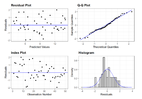
Figure 9. Image showing the residual plot (upper left) and index plot (lower left), which should show data randomly distributed around the y=0 line. The Q-Q plot (upper right) should have data points fall roughly on the y=x line, indicating that the residuals fall mostly within a Gaussian distribution. An alternative for looking at this is the histogram of the residuals plotted along with the estimated normal probability density function (lower right).
The data should be distributed according to a Gaussian distribution. One widely used method of determining if this assumption is accurate is with the quantile-quantile (Q-Q) plot. In the Q-Q plot, the quantiles of the estimated normal distribution are plotted against the quantiles of the residuals. If the residuals are normally distributed, the data points will fall on the y=x line. Deviations are normally seen in the tails of the data, but typically these are minimal in well behaved data. An alternative is to look at the histogram of the standardized residuals relative to the PDF of the standardized Gaussian distribution. Examples of these two plots can be seen in Fig. 9.
This is an important step in the process, but it should be noted that it takes experience to interpret these plots. Furthermore, there are quantitative statistical tests for many of these assumptions as well. Lastly, even if the assumptions don’t hold in the data, there are often ways of transforming the data to make the linear modeling approach better suited (e.g. Box-Cox transformations). This article briefly introduces these concepts, but for more information, we suggest further reading [e.g. 6-8].